

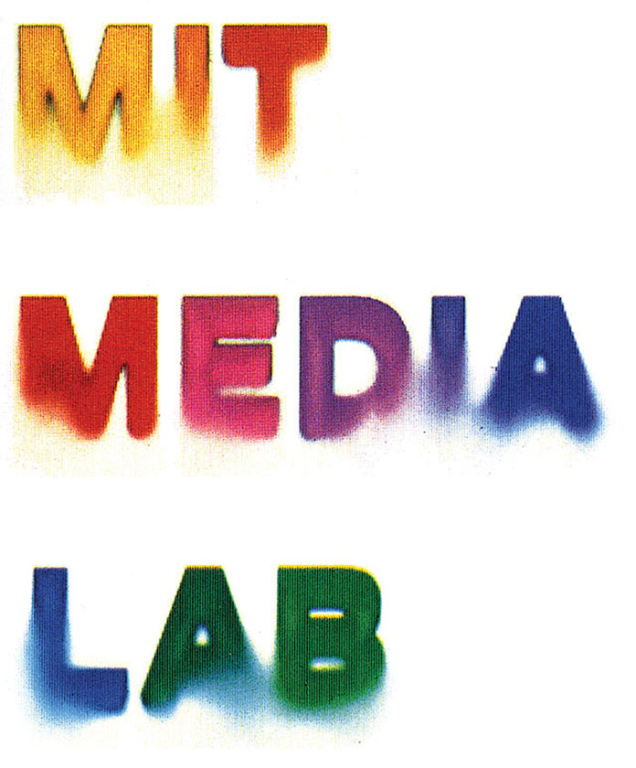
I became slightly obsessed with this piece, a poster for the Media Lab. No doubt a product of a mechanical process, I found the emergent lines, noise, and decay that connects the different letters really engaging. How much noise before something is unreadable? I couldn’t find a very high-quality version of the piece, so this is what I was working with:
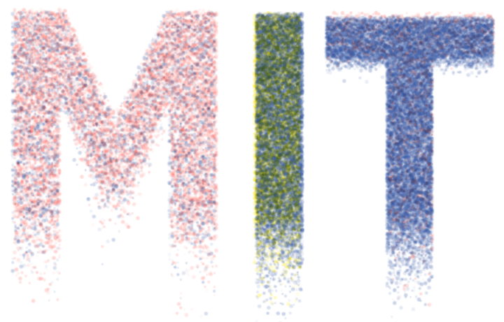
It struck me as looking sort of like a riso print, so I scrounged around for some examples of “making riso prints” in p5, which, luckily, Sam Lavigne and company had done for me. To start, I turned each letter into a dot array at a certain resolution. Then, added some noise to each point’s alpha and position, dependent on how far down the letter it is. Adding some additional color layers gives a nice effect, too.
This isn’t quite right. if you look at the example above, the “noise” follows a kind of line. This led me to create a “noise threshold” generated using perlin noise that cuts through each character, making a nice effect IMO, but it’s quite harsh (left). I fixed this by increasing the likelihood that points follow some random noise the closer they are to this line (right)
 A strict line is too harsh...
 But increasing the likelihood of random “clouding” of points as they
approach the same line is much smoother and closer
But increasing the likelihood of random “clouding” of points as they
approach the same line is much smoother and closer
This came pretty close in my view. Mapping point’s alpha to the y-axis withine ach letter also helped. If I were to spend more time—I think the points need to be more spatially contained, and alpha should be more liberally applied past the “noise line” instead of randomness.
But I do like the overall effect below. The riso package I used allows for exports that are compatible with real riso printers! If I ever get my hands on one I'd love to print out a few of these.